Preview our pages and access documentation
Explore our comprehensive job portal platform
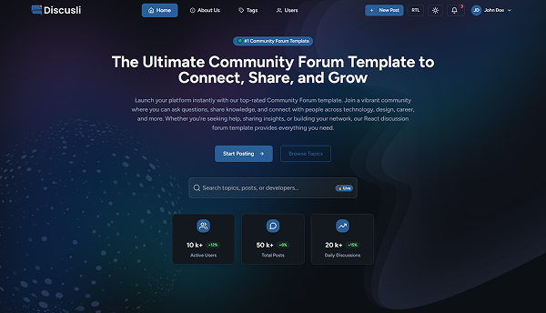
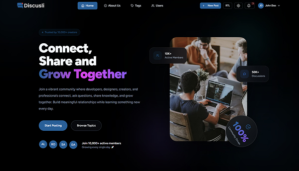

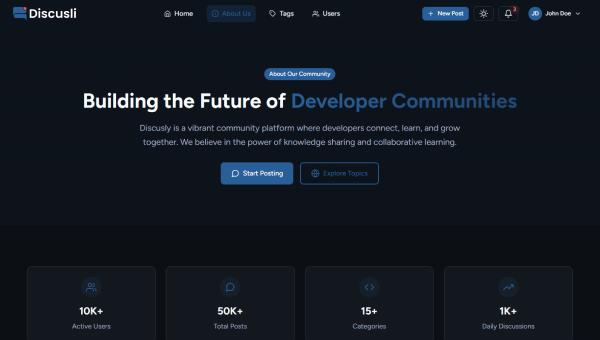
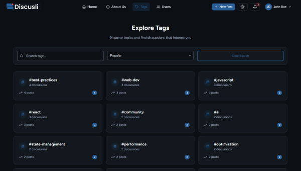
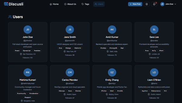
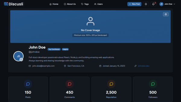
Explore our comprehensive discussion platform
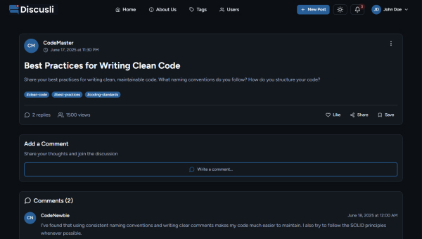
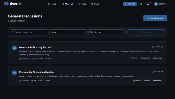
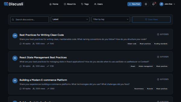
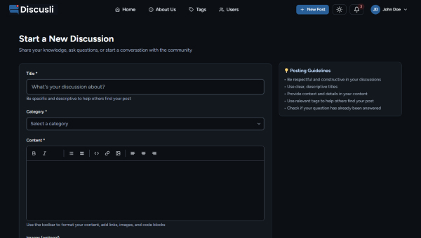
Explore our comprehensive discussion platform
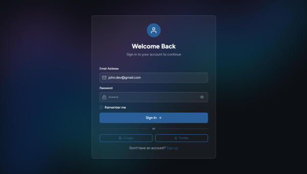
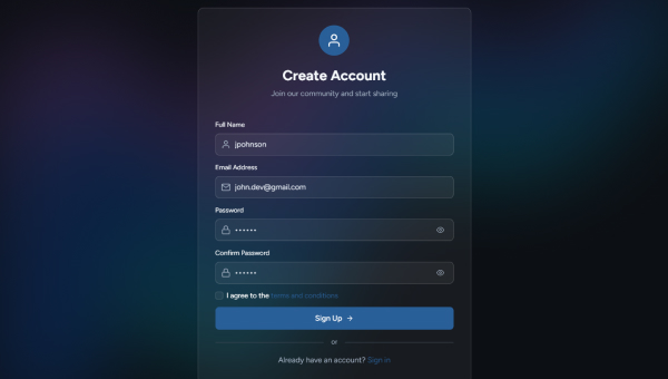
Explore our comprehensive discussion platform

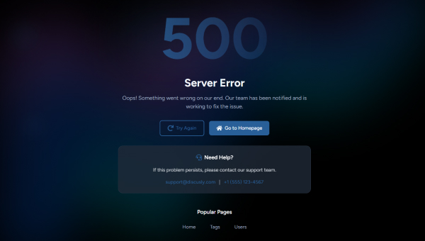
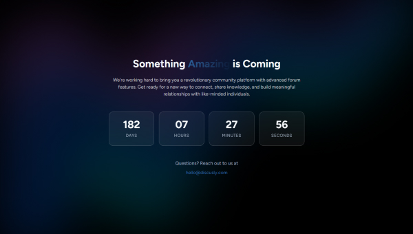
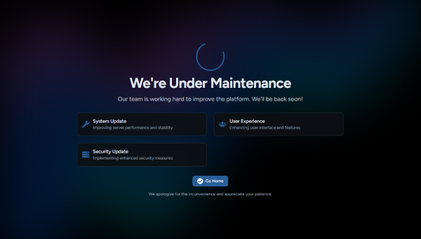
Discusli is a modern discussion platform. Built with React.js and Tailwind CSS, it features beautiful UI and responsive design, ensuring a great experience for users.
Advanced discussion search with filters and real-time updates
Detailed community profiles and discussion listings
Manage your profile, preferences, and more.
v19.1.0 → v19.2.8v3.4.17 → v3.4.19v7.6.2 → v7.18.1v12.18.1 → v12.42.2v2.2.4 → v2.2.10v5.5.0 → v5.7.0v5.4.2 → v6.2.3v2.1.4 → v6.0.1Discusli/
├── documentation/
├── Screenshots/
├── Template/
│ ├── public/
│ ├── src/
│ │ ├── assets/
│ │ ├── components/
│ │ │ ├── ui/
│ │ │ ├── layout/
│ │ │ ├── index.js
│ │ ├── context/
│ │ ├── data/
│ │ ├── hooks/
│ │ ├── pages/
│ │ │ ├── auth/
│ │ ├── router/
│ │ ├── utils/
│ │ ├── App.jsx
│ │ ├── App.css
│ │ ├── index.css
│ │ ├── index.js
│ │ └── main.jsx
│ ├── package.json
│ ├── package-lock.json
│ ├── tailwind.config.js
│ └── vite.config.js
├── CHANGELOG.md
└── README.mdStores static assets like images.
Contains all reusable React components, organized by feature or type.
Holds React Context API providers for global state management.
Stores mock data, data fetching logic, or other data-related utilities.
Contains main layout components (e.g., Navbar, Footer, Sidebars).
Contains top-level page components, each corresponding to a specific route or view.
Defines application routes and navigation logic.
npm installnpm startHere are the key dependencies and their versions used in this project:
| Package | Version | Description |
|---|---|---|
@headlessui/react |
^2.2.10 | UI components for React |
@headlessui/tailwindcss |
^0.2.2 | Tailwind CSS plugin for Headless UI |
framer-motion |
^12.42.2 | Animation library for React |
react |
^19.2.8 | Core React library for building user interfaces |
react-countup |
^6.5.3 | A React component to make numbers count up |
react-dom |
^19.2.8 | React DOM rendering for web applications |
react-icons |
^5.7.0 | SVG icons for React projects |
react-router-dom |
^7.18.1 | Routing library for React applications |
src/components/layout/ - Common layouts and navigation
src/components/home/ - Components for home page and discussions
src/components/ui/ - Reusable common UI components
src/pages/auth/ - Components for authentication
src/components/ui/Modal/ - Reusable modal components
src/pages/Home.jsx - Main landing page with trending discussions
src/pages/CategoryPage.jsx - Discussion categories and topics
src/pages/DiscussionDetail.jsx - Detailed discussion view and replies
src/pages/NewPostPage.jsx - Create new discussion posts
src/pages/TagPage.jsx - Discussion tags and filtering
src/pages/TagsPage.jsx - Browse all discussion tags
src/pages/ProfilePage.jsx - User discussion profiles
src/pages/UserProfilePage.jsx - Detailed user profiles
src/pages/UsersPage.jsx - Browse community members
src/pages/NotFound.jsx - 404 Not Found page
src/pages/ServerError.jsx - Server error page
src/pages/UnderMaintence.jsx - Maintenance mode page
Theme colors are defined in your tailwind.config.js file within the theme.extend.colors object.
tailwind.config.js:// tailwind.config.js
export default {
// ...
theme: {
extend: {
colors: {
light: {
background: '#FFFAF0',
surface: '#FFFFFF',
// ... other light mode colors
},
dark: {
background: '#000000',
surface: '#0c0f14',
// ... other dark mode colors
},
primary: "#6E85B7",
},
// ...
},
},
// ...
};The "Figtree" font is imported in src/index.css
and applied globally. Custom font sizes are defined in tailwind.config.js.
src/index.css)/* src/index.css */
@import url('https://fonts.googleapis.com/css2?family=Figtree:wght@300;400;500;600;700&display=swap');
/* ... Tailwind directives ... */
@layer base {
body {
font-family: 'Figtree', sans-serif;
}
}We offer 6 months of support for any questions or issues you may encounter.
Discover the powerful technologies and tools that make our platform exceptional

Dynamic UI Library

Utility First Framework

Smooth Animations

Web Structure

Modern Styling

Mobile Friendly

Web Typography

Vector Graphics

Clean Aesthetics

Flexible Components

Optimized Structure

Clear Guides

Always Available